This brand resource kit has been carefully crafted to ensure consistency and clarity when using the Nondon brand across various media and platforms. Whether you’re a designer, developer, partner, or media representative, this kit provides the core visual elements of our identity—logos, typography, and colors—that reflect the essence of our brand.
The Nondon logo symbolizes creativity, cultural depth, and modern design sensibilities. When using the logo, it’s essential to maintain proper spacing, color usage, and background contrast to preserve its visual integrity and brand impact.
Typography
Our typography system combines modern sans-serif and classic serif fonts to ensure readability and versatility in both English and Bengali communications. This thoughtful pairing allows the brand to remain consistent in tone, regardless of language or platform.
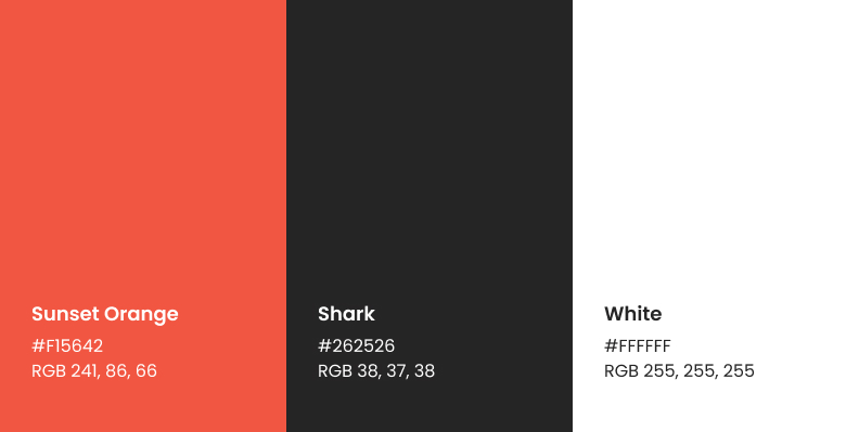
Color
The color palette—with bold Sunset Orange, grounded Shark Gray, and crisp White—was selected to convey energy, professionalism, and clarity. These colors should be used strategically to highlight key elements and maintain a consistent brand experience.
We encourage all collaborators to follow these guidelines to help us maintain a unified and recognizable brand presence across all touchpoints.